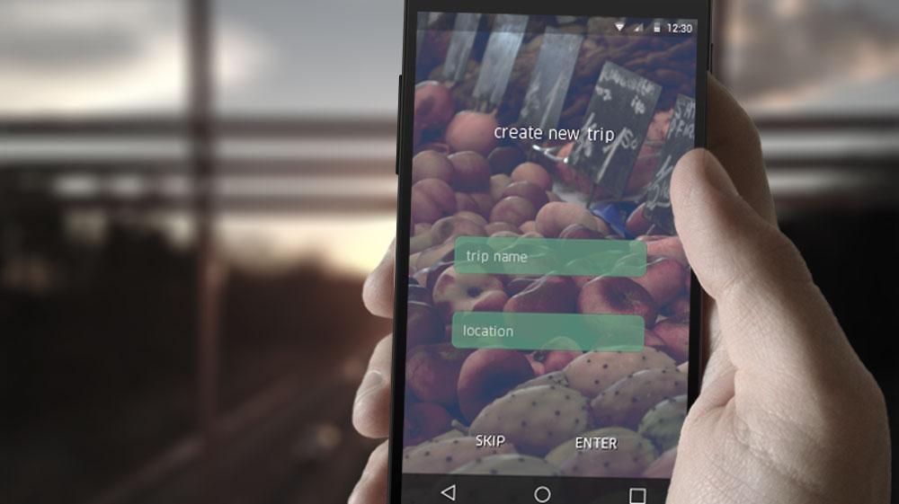

The main focus of the project was to develop how the people deal with their pictures during a journey and what they would like to do with them afterwards.
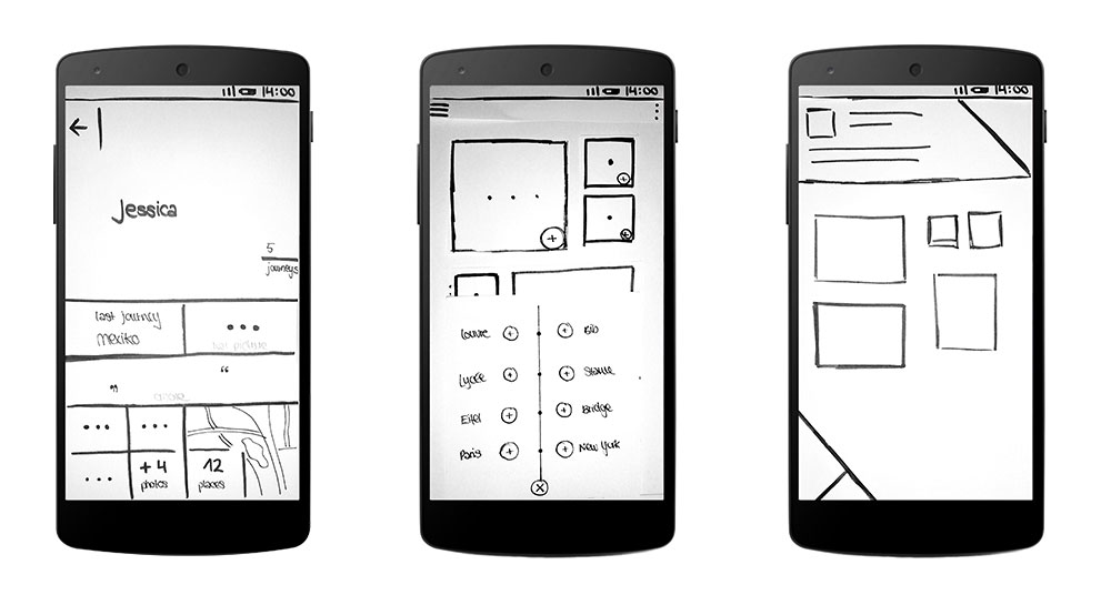
During an intense research phase existing competitors on the market were identified, Personas were created which lived through the project and methods such as the SWOT and KANO analysis were used to find out what the users' needs are. Having built an information architecture with the features sorted by their importance, first paper prototypes were tried out:

Based upon the information architecture it was now tried to figure out which step should be presented at which part in the application to have a simple and clear navigation and to include the users’ wishes. Different approaches were created and transferred into first rough digital wireframes.
To find an own look and feel different color options and diverse solutions for single items were handled. Likewise the optimal position and form for a ideal recognition should be identified.

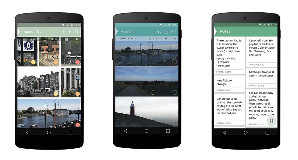
In the end it resulted in a strong green main color combined with a medium grey used for highlighting. Everything was arranged in a grid based upon the google material design and a consistent and clear icon family with its own character was developped.
The prototype was created with Flinto. It was used to show the navigation through the application. To receive a better impression of one of the most counting elements – the animations and the behaviour of the application when the user interacts with it – a walkthrough was animated in after effects. Moreover this walkthrough was used for a little productvideo which shall introduce the application and explain the most important facts. Some short animations can be seen below.
Project
Application Design 1
Third semester
mentoring by Jürgen Graef
January 2016
Tools
Illustrator
Flinto
After Effects
Premiere Pro
© Verena Maier 2016 I Imprint