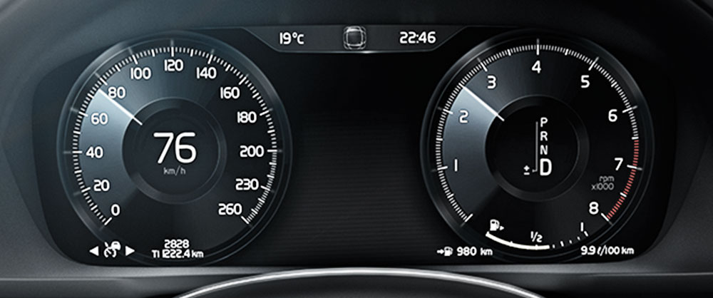

Currently existing dashboards in the interior of automotives often seem overloaded because there are a lot of different items which may distract the driver. This is an essential insight used for a redesign of this important part in a very simple way just consisting of the main features that are needed while driving.

The aim was to create a new interface supporting the driver in giving him relevant information and not attracting his attention. This should be achieved by including the aspect of peripheral vision.
Compared to older dashboards the new design is based on a digital display. This enables a dynamic, intuitive interface and allows to include the users’ demands. The most important detail which was recognized, was the tachometer. In nearly every demonstration it was shaped in a round form reminding of a tube. In conclusion, there had to be found an agreement between the design for the peripheral vision and the drivers’ customisation to the round design. The consistency of the speedo was seen as a challenge to develop new possibilities of its presentation. Moreover, the following core features were identified: speed, eco-level, fuel gauge, gear change, blinker and warning messages.
Compared to older dashboards the new design is based on a digital display. This enables a dynamic, intuitive interface and allows to include the users’ demands. The most important detail which was recognized, was the tachometer. In nearly every demonstration it was shaped in a round form reminding of a tube. In conclusion, there had to be found an agreement between the design for the peripheral vision and the drivers’ customisation to the round design. The consistency of the speedo was seen as a challenge to develop new possibilities of its presentation. Moreover, the following core features were identified: speed, eco-level, fuel gauge, gear change, blinker and warning messages.
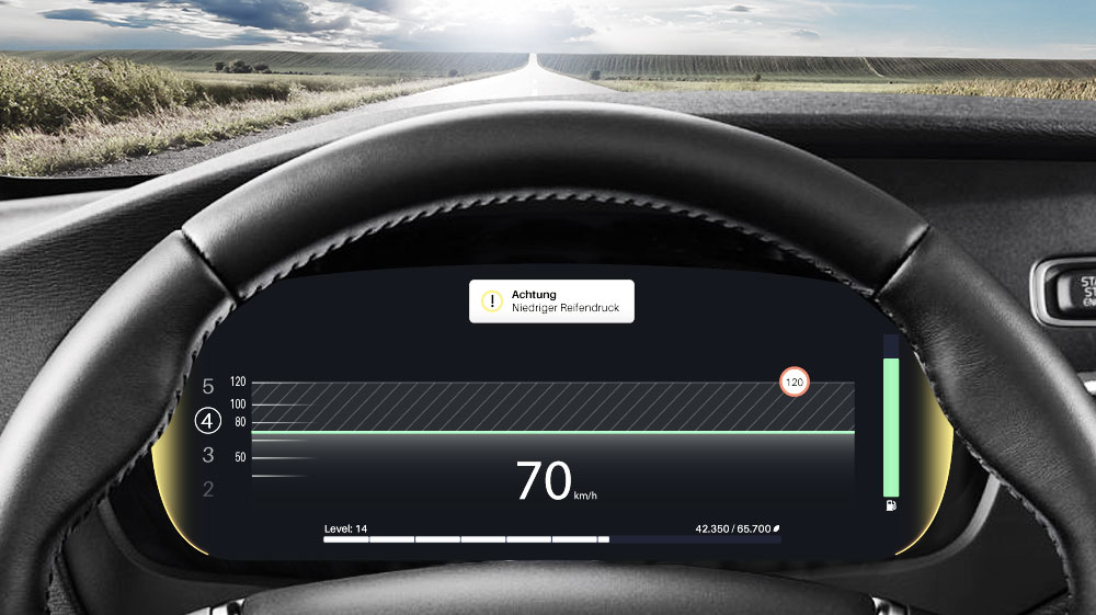
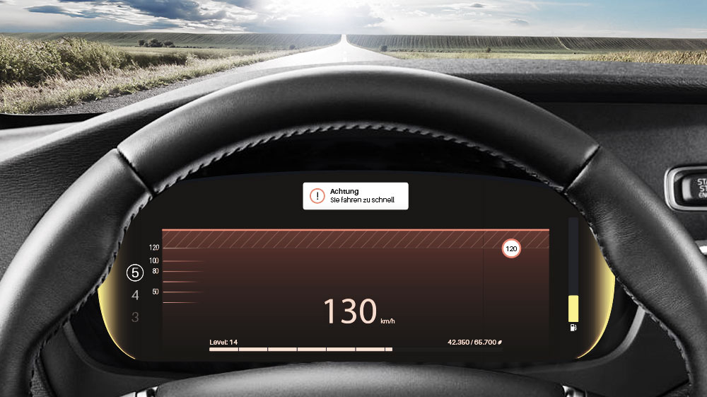
In the beginning of the design process it was agreed to place the features with the most importance in the center. The relevance of the separate elements diminishes towards the periphery which is in direct relation to the peripheral vision. In the end it resulted in yellow blinkers on the right and left side with a little blur. Then on the one handside the fuel gauge and the gear change and in the center the speedometer. It takes the biggest part of the display and moves in horizontal direction. The color changes from green to red if the allowed speed is exceeded. The alarm appears in the upper half of the screen and the eco-level is shown at the bottom.
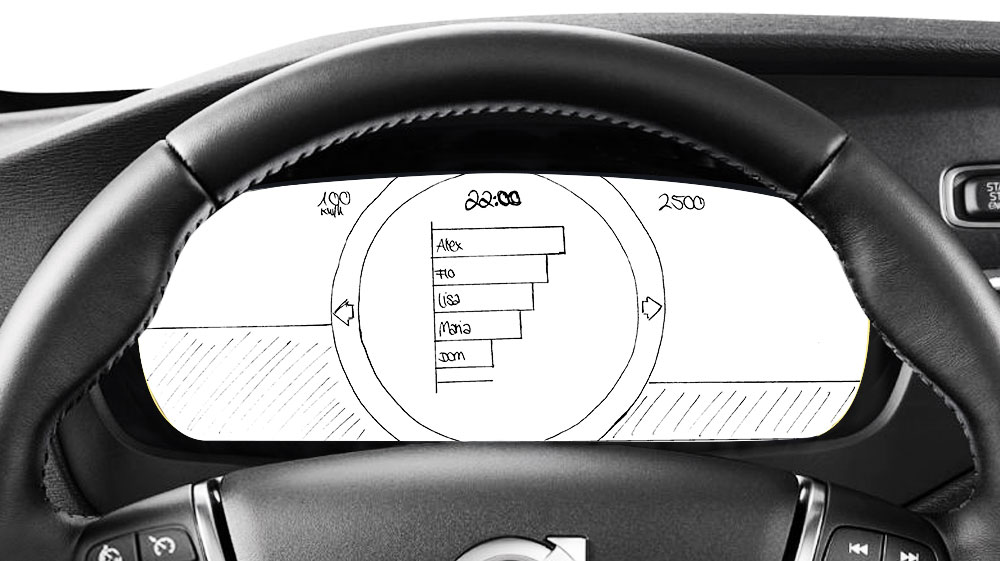
To achieve these results, in the beginning some paper prototypes were created (as represented below). To find out which presentations can be handled by the driver, a lot of variations were tested. Especially the optimum speed of the animated parts such as the speedometer or the alarm messages had to be found out.
To achieve these results, in the beginning some paper prototypes were created (as represented below). To find out which presentations can be handled by the driver, a lot of variations were tested. Especially the optimum speed of the animated parts such as the speedometer or the alarm messages had to be found out.

In the end the prototype was animated and programmed with Unity. The components were created in Illustrator and photoshop. A regular iMac was covered by an interior of a car on paper and the prototype could be experienced with a X-Box-controller.
Project
Interface Design 1
Second semester
mentoring by Thomas Techert
June 2015
Tools
Illustrator
Unity
© Verena Maier 2016 I Imprint